

At Signimpact in the storefront Sign is the silent salesperson for your company in the cutthroat business world, interacting with potential clients long before they set foot inside. A vital element that can significantly influence this nonverbal exchange is the color scheme you choose for your storefront sign. Your colors can arouse particular feelings, affect perceptions, and mold potential customers’ views of your company.
Recognizing Color’s Effect on Consumer Psychology
The significance of color in the complex dance of consumer behavior cannot be emphasized. The colors you use for signs significantly impact how people perceive you, feel about you, and make decisions. This article delves into the complex field of color psychology, examining how selecting the appropriate colors may create a memorable brand story.
1. The Power of Red: Vibrant and Captivating
Red is a powerful color in consumer psychology. It radiates energy and draws attention, which makes it an excellent option for companies looking to make a statement. Restaurants frequently use red because it piques the appetite and conveys a sense of urgency that encourages patrons to act.
2. Calm and Trust in Blue Tranquility
Blue is an excellent color for companies that want to exude confidence and serenity. Because it is frequently connected to dependability, this color is well-liked by financial institutions, technology firms, and healthcare services. A blue storefront sign can give people a sense of trustworthiness and reliability.
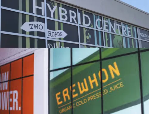
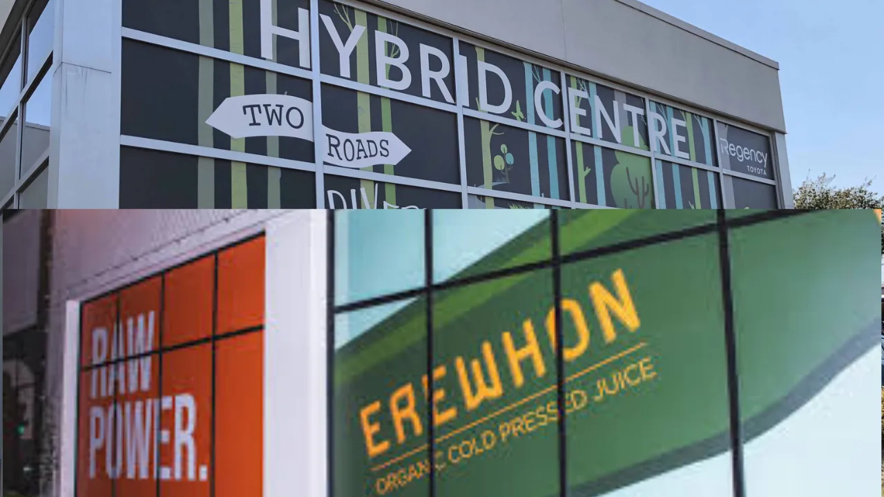
3. Green for Development and Well-being: Attracting Eco-Friendly Viewers
If your company promotes wellness, the environment, or the natural world, consider using green in your store sign. Green is associated with health, development, and environmental awareness. It appeals to a customer base that highly values ecological harmony and sustainability.
4. The Calming Aspects of Yellow: Hope and Coziness
Yellow is a cheerful and comforting color. In addition to being happy, it can make a place feel friendly. Yellow is a popular color choice for businesses in the retail and hospitality industries because it elicits happy feelings and puts customers at ease.
Tailoring Coloring for Your Brand Identity
The colors you select are the notes in the symphony of brand representation, helping to create a memorable and harmonious tune. As a visual overture, your store sign sets the tone for how the public will see your company. In this investigation, we break down the technique of matching colors to your brand identity and reveal the complex relationship between color and brand personality.
1. Complementing the Brand’s Individuality
An extension of your brand identification is your sign. It must fit with the persona you wish to project. Vibrant hues like orange or purple can capture the essence of your company if it is lighthearted and youthful. Use subdued colors like gray or blue for a more elegant look.
2. For Visibility, Contrast
The visibility of a shop sign is crucial. Selecting hues that offer a striking contrast guarantees that your text can be read well, even at a distance. For example, using light-colored text on a dark backdrop or vice versa can improve visibility and get more customers to your store.
The Effects of Cultural Factor: Symbolism in Culture
Different cultures have varied interpretations of colors. Understanding the cultural background is essential, mainly if your company serves a varied clientele. White may represent purity in Western societies, but it can also express grief in many Eastern cultures. Conducting an in-depth study of the cultural meanings of colors is crucial to prevent accidental messaging.
Iteration and Testing to Get the Best Outcomes
Creating a vibrant storefront sign takes more than just choosing the ideal colors. A strategic commitment to testing and iteration becomes the key to success to guarantee optimal results. This guide explores the scientific method that turns Signimpact into a potent attention-getter for passersby.
1. Practical Learning Through A/B Experiments
The key to improving your sign approach is A/B testing. Using this approach, you may test many iterations of your sign to see how well it communicates with customers. Gaining significant real-world insights into what appeals most to your audience can be achieved by creating a controlled environment in which one variable (content, color, layout, etc.) is altered while the rest stay unchanged.
2. Color Differences and Their Emotional Effect
A/B testing allows you to play around with various color saturations and hues. Analyze how each variation makes you feel. Does a particular color scheme make you feel better than another? Does it encourage more rapid interaction? Quantifiable data from A/B testing helps you create color decisions based on real customer behavior.
Improve Your Brand with Well-Considered Color Selections
In summary, the colors you choose for your store sign are deliberate selections that have the power to affect how customers perceive you significantly. A storefront sign that draws attention and connects with your target audience on a deeper level may be made by grasping the psychology of color and integrating it with your company identity.
Remember that your storefront sign is the beginning of your brand’s story, so make it interesting, significant, and hard to miss.


