

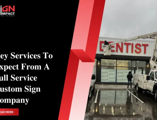
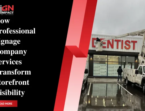
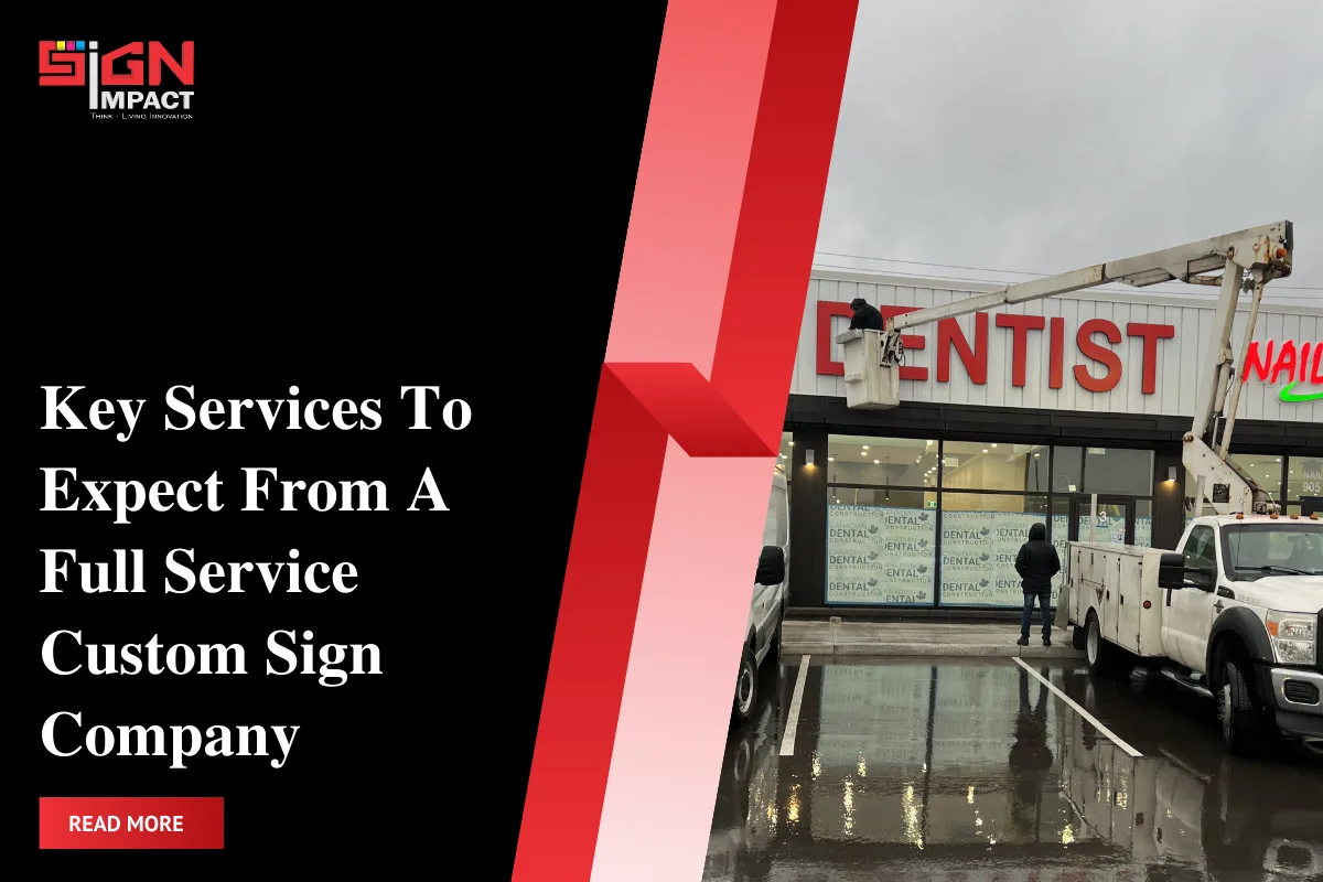
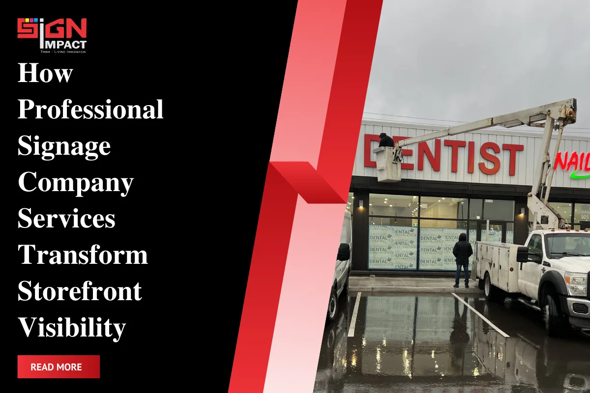
When visitors step inside your space, your interior visuals are doing far more than decorating walls—they’re guiding choices. The right indoor signs, thoughtfully designed and installed, can shorten decision time, reduce uncertainty, and move customers toward the next step. In this guide, we break down three of the most effective tools for conversion-focused interiors: office signs, wall graphics, and window frosting, and how to deploy them as part of your broader strategy for custom business signs. For a full framework on planning signage across your brand experience, see the pillar resource: Complete overview: “The Ultimate Guide to Custom Business Signs and Business Signs Services.”
Signimpact, a Milton, ON-based company, designs, fabricates, and installs indoor signs for businesses throughout Ontario. Whether you manage a healthcare clinic, a retail showroom, or a tech workspace, this field-tested playbook will help you turn every square foot into a clear pathway to action.
Why Indoor Signs Are Your Silent Sales Team
Indoor signs work because they reduce friction. People take action when they see the appropriate cue at the right moment, indicating where to go, what to do next, why they should trust you, and which offer is tailored for them. Converting interiors delivers on four core jobs:
- Orient visitors: Directional and identification signs reduce cognitive load and anxiety.
- Inform and reassure: Compliance and policy signs set expectations and increase trust.
- Persuade with context: Wall graphics and callouts highlight value, social proof, and brand credibility.
- Protect privacy and focus: Window frosting and films shape sightlines and reduce distractions.
When these components are integrated, you build a consistent journey that supports your brand story and turns foot traffic into measurable outcomes like appointments booked, demos scheduled, sign-ups captured, and sales completed. As a part of your custom signage for businesses, indoor assets should be planned with the same rigor as any marketing campaign.
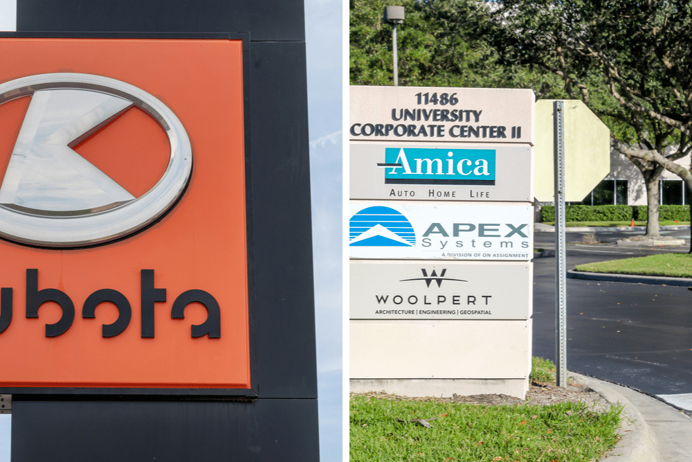
Office Signs That Guide and Persuade in Custom Business Signs

Office signage is the backbone of an effective interior. Done right, it’s both functional and persuasive. Here’s how to design for clarity and conversion.
1) Reception & Lobby Signage
First impressions set expectations. A dimensional logo or illuminated panel behind reception functions as an anchor point so visitors know they’re in the right place, and your brand presence is felt immediately.
- Materials: Acrylic, brushed aluminum, copper/brass laminates, or layered PVC for dimensionality.
- Finish: Matte or satin to reduce glare in bright lobbies; high-gloss for modern tech environments.
- Add a micro-CTA: A subtle line like “Check in via QR” or “Scan for guest Wi-Fi” can streamline flow.
2) Wayfinding & Room Identification
Clear directional signs shorten time-to-task in custom business signs and improve perceived service quality. Use consistent icons, arrows, and naming conventions across floors and departments.
- Hierarchy: Primary destinations first (reception, washrooms, meeting rooms), then secondary (printer, kitchen, IT).
- Distance legibility: A practical guideline suggests a letter height of 2.5 cm for every 3 meters of viewing distance.
- Compliance: For Ontario spaces, consider accessibility needs (contrast and tactile elements, where required).
3) Compliance & Policy Signs
Visible, well-designed policy signs reduce staff interruptions and support risk management. Think visitor badges, safety notices, and building protocols.
- Contrast: Aim for high contrast between text and background for readability.
- Placement: Eye level near decision points: entrances, elevators, and check-ins.
4) Persuasive Callouts Near Points of Decision
Place small-format callouts where choices are made: meeting room doors (service menus or case studies), product shelves (benefit bullets), and promo counters (limited-time offers). These micro-messages can lift conversion when aligned with your overall strategy for custom business signs.
Sources:
[1] Reclamation, U. S. B. O. (2006). Sign guidelines: for planning, designing, fabricating, procuring, installing, and maintaining signs for outdoor public use areas. [source]
Wall Graphics That Tell a Story and Drive Action

Wall graphics transform dead space into brand storytelling, education, and action. They’re ideal for custom business signs, clinics, gyms, showrooms, and educational environments across Milton, Mississauga, Toronto, and the GTA.
1. What to Feature
- Brand narrative: Your mission, values, and differentiators in a visually engaging arc.
- Social proof: Client logos, testimonials, ratings, and awards to build trust fast.
- Process visuals: “How it works” infographics that reduce purchase anxiety.
- Directional CTAs: “Book a tour,” “Start your trial,” or “Join our community” with QR codes.
2. Material Options
- Removable vinyl: Great for leased spaces and seasonal campaigns.
- Cast vinyl: A premium, durable option for complex surfaces and long-term use.
- Textured films: Add depth or a brushed finish for upscale interiors.
3. Design Tips to Maximize Conversion
- One big idea per wall: Avoid a collage of messages; focus beats clutter.
- Use contrast and negative space: Make your CTA the focal point.
- Avoid “banner blindness”: use authentic photography and on-brand illustration styles.
- Measurable CTAs: QR codes routed to unique landing pages aid ROI tracking.
Window Frosting and Privacy Films: Function with Polish

Window frosting (etched or frosted films) solves a core environmental challenge, privacy, while elevating brand presence. Frosting manages sightlines without sacrificing natural light in open-plan offices, clinics, law firms, and financial services that feature custom business signs.
1) Use Cases
- Meeting rooms and offices: Maintain confidentiality while passing the “glass box” aesthetic test.
- Reception and corridors: Reduce distractions; cue visitors to stay in public zones.
- Retail storefronts: Define premium zones and highlight promotions with cut-through graphics.
2) Design Approaches
- Banding: Horizontal bands at eye level for privacy and safety.
- Patterned films: Geometrics or organic textures that reinforce brand mood.
- Logo cut-outs: Clear negative space reveals your identity without clutter.
- Gradient frost: Privacy below, openness above, ideal for collaborative rooms.
3) Technical Notes
- Film types: Dyed, metallized, or ceramic films for varying light transmission.
- Durability: Quality films (e.g., architectural lines from leading brands) keep edges crisp and resist peeling over years.
- Maintenance: Clean with non-abrasive solutions; avoid blades on film edges.
When combined with office signs and wall graphics, window frosting becomes a seamless component of your custom business sign ecosystem, balancing privacy, brand, and navigation.
Useful Resource:
[1] Basher, M. K., Nur-E-Alam, M., Rahman, M. M., Alameh, K., & Hinckley, S. (2023). Aesthetically Appealing Building Integrated Photovoltaic Systems for Net-Zero Energy Buildings. Current Status, Challenges, and Future Developments—A Review. Buildings, 13(4), 863. https://doi.org/10.3390/buildings13040863
Comparison: Which Interior Solution Fits Your Goal?
| Goal | Office Signs | Wall Graphics | Window Frosting |
|---|---|---|---|
| Brand Presence | Strong (reception logos, plaques) | Very strong (feature walls) | Moderate (logo cut-outs, patterns) |
| Wayfinding/Clarity | Very strong (directional systems) | Moderate (context cues) | Low (indirect guidance) |
| Privacy/Focus | Low | Low | Very strong |
| Promotions/Offers | Moderate (counter callouts) | Strong (campaign walls) | Moderate (etched promos) |
| Install Time | Fast–Moderate | Fast | Fast |
| Typical Lifespan | 3 to 7 years | 2–5 years | 5–10 years |
Design Principles That Drive Conversion
- Clarity beats cleverness: Use plain language, short headlines, and one ask per sign.
- Hierarchy is everything: Headline, subhead, and CTA should be scannable at a glance.
- Scale for distance: Match letter height to viewing distance and light conditions.
- Contrast and color: Ensure sufficient contrast; reserve brand accent colors for CTAs.
- Consistency builds trust: Align typography, colors, and iconography across all custom business signs.
- Wayfinding logic: Place signs at decision points: intersections, entrances, and endpoints.
- Messaging discipline: If a sign isn’t doing a job guiding, informing, or persuading, remove it.
Materials, Finishes, and Lighting for Interior Impact
Material choices influence durability, maintenance, and brand perception. Lighting amplifies them.
1) Core Materials
- Acrylic: Clean, modern; excellent for dimensional logos and directional panels.
- Aluminum/Metal laminates: Premium feel for corporate environments and professional services.
- PVC/Komacel: Cost-effective for back-of-house or temporary directional systems.
- Vinyl films: The workhorse for wall graphics and window frosting, with removable or permanent adhesives.
2) Finishes
- Matte/Low-glare: Best for readability under overhead lighting.
- Textured/Brushed: Adds sophistication to executive spaces.
- Anti-graffiti laminates: Useful in high-traffic corridors and public facilities.
3) Lighting
- Backlit or halo-lit logos: Subtle, premium effect in reception zones.
- Spotlighting: Draws attention to key CTAs or feature walls.
- Color temperature: 3500 to 4000K often balances warmth and clarity indoors.
How to Plan Indoor Signage: A Practical Workflow

- Define conversion goals: What action should each area encourage (book, buy, sign up, inquire)?
- Map the journey: Walk the space like a visitor. Note confusion points and decision points.
- Prioritize zones: reception, corridors, meeting rooms, product areas, and exits.
- Choose formats: office signs for wayfinding, wall graphics for storytelling, and window frosting for privacy.
- Create messaging: Short headlines with one CTA per sign; add QR codes for trackability.
- Select materials: Match durability and finish to traffic, cleaning, and brand aesthetic.
- Prototype and test: Print small mockups; test legibility and placements.
- Install professionally: Ensure accurate leveling, alignment, and surface prep.
- Measure and iterate: Track scans, bookings, and sales tied to signage zones; refine quarterly.
Measuring ROI of Indoor Signs
Indoor signage ROI is best tracked by linking each sign to a measurable micro-conversion.
- Unique QR/URLs: Assign a unique code to each sign to capture scans and visits.
- Offer redemption: Use sign-specific promo codes or landing pages.
- Lead capture: Place signs near iPad kiosks or reception check-ins.
- Before/after tests: Compare conversion rates after adding a wall graphic or CTA panel.
- Heat maps and dwell time: Optional use of sensors in showrooms or experiential zones.
For organizations managing multiple locations across Ontario, standardize metrics so you can compare performance across Milton, Hamilton, Kitchener-Waterloo, Toronto, and beyond.
Local Compliance and Approvals in Ontario
Most indoor signs do not require municipal permits, but property management and landlord approvals are common. Healthcare and educational environments may have additional requirements around accessibility and safety.
- Accessibility: Ensure adequate contrast; consider tactile/raised lettering where required by the environment.
- Fire and safety: Maintain clearances and avoid blocking exits, sprinklers, or detectors.
- Building standards: Follow landlord specifications for films and adhesives on glass to protect warranties.
Signimpact assists with drawings, spec sheets, and approvals to streamline installation across Ontario facilities, aligning interior assets with your overall custom business signs program.
Ontario Case Snapshots: From Idea to Install
1) Milton Dental Clinic
Goal: Improve patient flow and privacy.
Solution: Frosted bands with logo cutouts on operatory glass, a reception logo panel in acrylic, and simple wayfinding to hygiene rooms.
Result: Fewer front-desk interruptions and faster room turnover.
2) Mississauga Tech Startup
Goal: Onboard visitors and encourage demo sign-ups.
Solution: Feature wall graphic showing a three-step product story, QR code to book demos, and directional floor decals leading to the demo suite.
Result: Higher QR scans and improved tour completion rates.
3) Toronto Co-Working Space
Goal: Define zones and reduce distractions.
Solution: Gradient window frosting on meeting rooms, consistent room ID signs, and color-coded directional signage.
Result: Member feedback cited improved privacy and wayfinding clarity.
Why Choose Signimpact for Interior Signage
- End-to-end capability: Strategy, design, fabrication, and installation are coordinated for speed and quality.
- Quality materials: Architectural-grade films and substrates that stand up to real-world use.
- Approval support: Drawings/specs for landlord and property management reviews.
- Ontario-wide install: from Milton HQ to the GTA and across the province.
- Brand consistency: Cohesive systems that unify your custom business signs inside and out.
Soft CTA: Talk to Signimpact for a quick discovery call to share your floor plan, goals, and timeline, and we’ll recommend the right mix of office signs, wall graphics, and window frosting for measurable outcomes.
FAQ: Indoor Signs That Convert

Q: How long do interior signs typically last?
With quality materials and proper installation, office signs and window films can last 5 to 10 years, while wall graphics often perform for 2 to 5 years depending on traffic and cleaning routines.
Q: Do I need permits for interior signage in Ontario?
Municipal permits are usually not required for interior signs. However, property management approvals are common. Signimpact provides drawings and specs to streamline approvals.
Q: What’s the best way to measure ROI?
Assign unique QR codes and URLs to key signs, track scans and conversions, and compare pre/post performance. For multi-site operations, standardize metrics across locations.
Q: Can window frosting include my logo or brand pattern?
Yes. We can incorporate logo cut-outs, gradient effects, and custom patterns to align privacy with brand expression without sacrificing natural light.
Q: How do indoor signs fit with my exterior signage?
Interior signage should extend your brand experience established outdoors. As part of your custom business signage, use the same color, type, and iconography for a seamless journey from storefront to reception to meeting room.
Conclusion: Turn Your Interior into a Conversion Engine
Office signs, wall graphics, and window frosting are high-leverage tools for shaping behavior inside your space. When used carefully, they make it easier for people to make decisions and take action, which is essential for a successful custom business sign strategy. If you’re in Milton, the GTA, or anywhere in Ontario, Signimpact can help you plan, design, and install a cohesive interior signage system that looks excellent and performs even better. Ready to transform your environment? Book a quick consultation, and let’s map your visitor journey from entry to action. For a comprehensive framework on how to align interior and exterior signage, be sure to check out this essential resource:
Complete overview: “The Ultimate Guide to Custom Business Signs and Business Signs Services.”