

Your storefront sign is your company’s face in today’s cutthroat business world, where first impressions can make or break customer involvement. Making a distinctive and memorable storefront sign is essential to making your business stand out from the competition and attracting consumers inside.
We’ll go into professional design advice in this extensive guide that will draw in customers and establish your company as a leader in your field.
Recognize Your Brand
It is essential to have a strong knowledge of your brand identity before tackling design aspects. Signimpact should convey your company’s personality, essential principles, and distinctive products or services. Step back and consider what makes you different from the competition. Does your brand have an air of classic elegance, or is it more current and edgy? Understanding this will direct all of your design choices.
Typeface Counts
Here are three features of typeface counts.
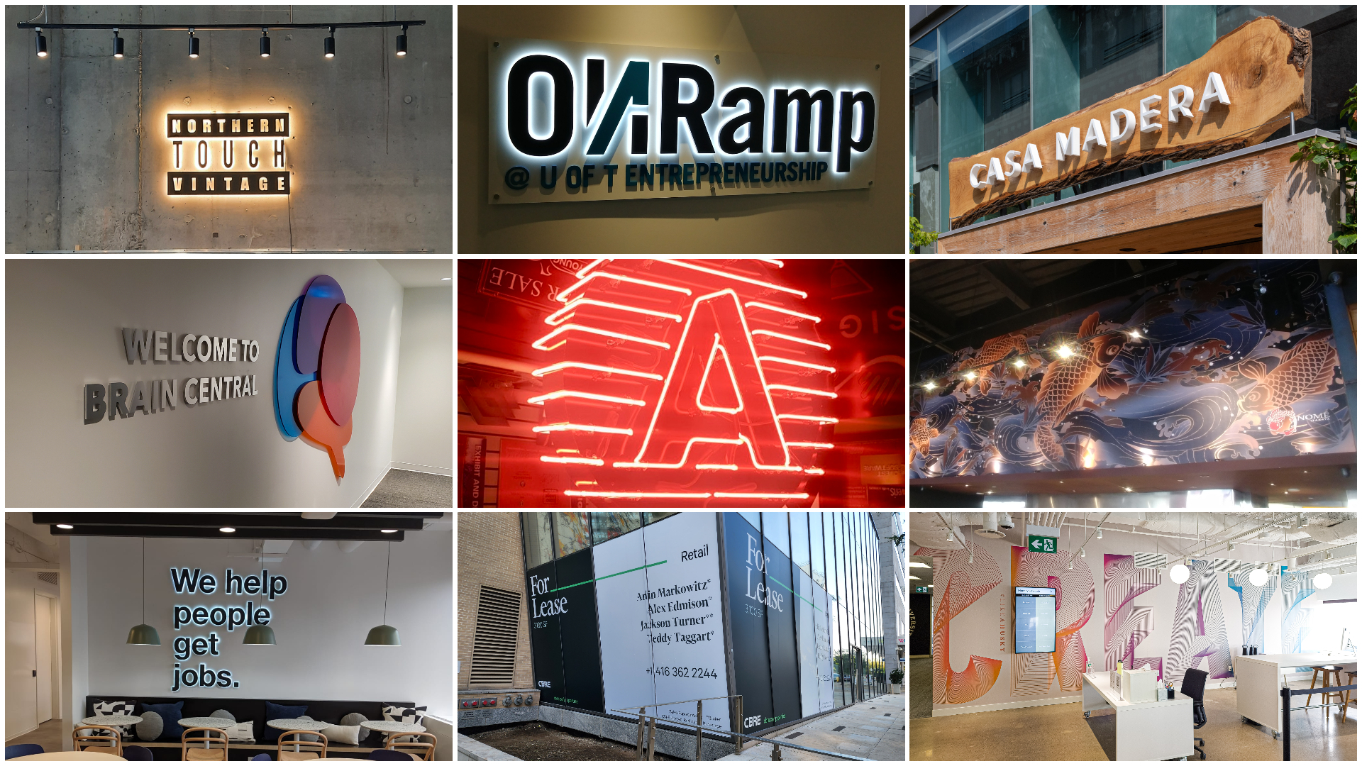
1. Select Unique Fonts
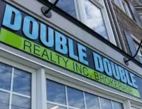
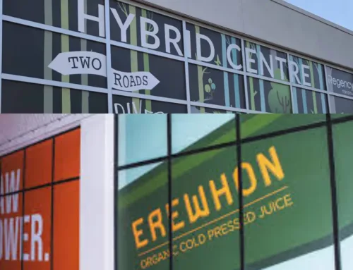
Typography is essential to communicate the personality of your brand. Select eye-catching fonts that complement your brand. Make sure it can be read at a distance, regardless of the font style—sleek sans-serif or traditional serif. Steer clear of highly elaborate fonts that could impair legibility.
2. Experiment with Hierarchy and Size
To highlight important information, play around with font sizes and hierarchy. Signimpact name should stand out, accompanied by characteristics that complement it, such as taglines or services. A well-proportioned hierarchy improves legibility and adds visual appeal to your storefront sign.
3. Sign Language’s Use of Color Psychology
Color can elicit particular feelings and connections and has a significant psychological effect on people. Select hues consistent with your brand and encourage the reaction you want from your intended market. Bold reds, for example, imply enthusiasm and vigor, while serene blues imply reliability. To produce a pleasing visual experience, keep your sign’s color palette consistent.
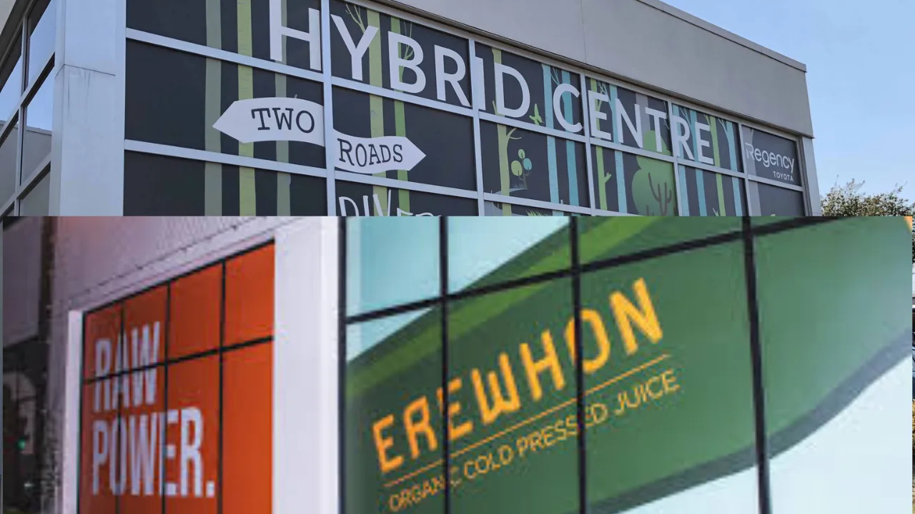
Graphics and Photography
Here are two features of graphics and photography.
1. Superior Photographic Work
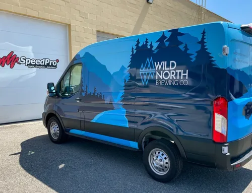
Invest in premium photos or graphics that complement your brand’s messaging. At Signimpact, the storefront sign will seem better overall if it has clear and crisp imagery, whether a striking logo or pertinent images. Select pictures that go well with your brand’s look and avoid clutter.
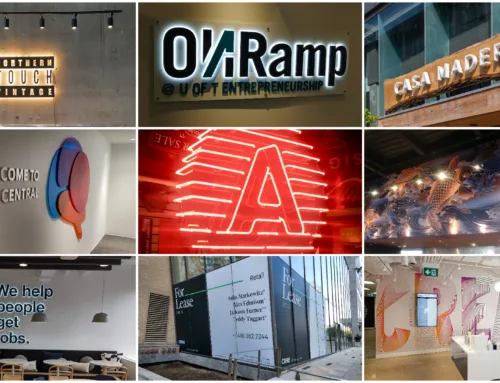
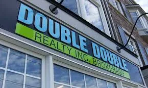
2. Include Your Logo
Your logo visually represents your brand. Make sure it’s displayed clearly on your shop sign. A well-positioned logo, whether a modern symbol or a wordmark, strengthens brand identification.
Why Simplicity is Important
Simplicity stands out in a world where visual stimuli are abundant. Designing a sign should be simple and uncluttered. A disorganized sign might confuse onlookers and weaken the message of your brand. Accept negative space to allow elements to breathe and draw the viewer in.
Light and Visibility
Here are two features of light and visibility.
1. Ideal Positioning
For visibility, placement must be strategic. Examine your surroundings and ensure that different angles allow you to see your sign. Think about any impediments that could impair your vision, such as trees or other buildings.
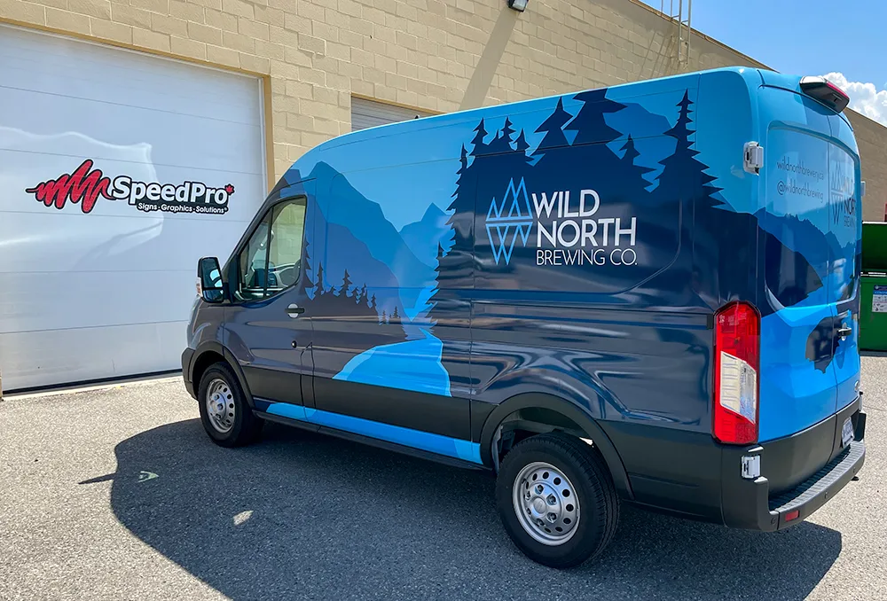
2. Lighting for a Nighttime Presence
You cannot compromise on adequate lighting if your company is open late. Make a well-thought-out lighting investment to guarantee your store sign is visible at night. It extends the visibility of your brand 24/7 while also improving safety.
Continual Upkeep
A faded, neglected sign gives prospective customers an incorrect impression. Maintaining the integrity of your store sign requires routine care. To display a lively and dynamic brand, keep it clean, replace any worn-out components immediately, and update the information as necessary.
To sum up, creating a storefront sign that genuinely makes an impression means carefully combining design aspects that complement your brand. Every element, from picture and clever placement to color psychology and typography, is essential to producing a sign that pops out on the street. By making a thoughtful design investment, you can connect with your target audience, draw them in, and stand out from the competition.