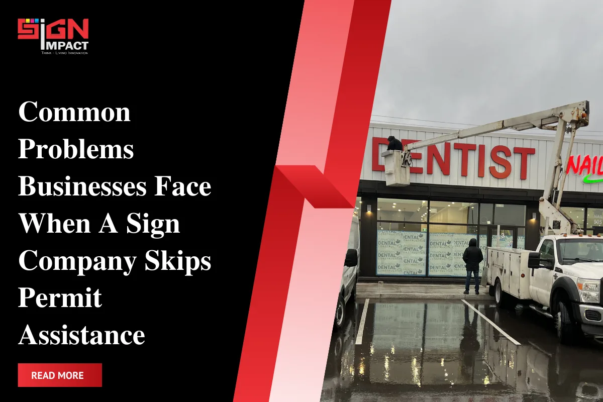
Your storefront does a lot of work before a word is spoken. When people pass by, they judge if you look open, trustworthy, and worth a visit. That first snap decision often comes from your storefront signage. Get it wrong and even great products sit unseen. Get it right and foot traffic rises, rain or shine.
We see the same missteps over and over: low contrast, small letters, weak lighting, cluttered layouts, and signs hidden by trees or awnings. The fix is not fancy. It’s about clear choices and a simple plan. If you are comparing options and materials, see our storefront signage page for a quick overview.
Sign Impact designs, permits, and installs signs every day, but this article is not a pitch. It’s a plain checklist to help you avoid costly mistakes. Keep it simple, readable, and visible. That’s your path to a storefront that pulls people in, not past.
Quick Summary
Most storefront mistakes fall into a few buckets: low contrast, tiny letters, dim lighting, bad placement, missing permits, messy branding, poor upkeep, and choosing the wrong sign for the building. Fixing these is more about basics than budget.
Focus on readable type, strong color contrast, clean layouts, and the right lighting for nights and cloudy days. Check sightlines from the sidewalk and the road, and confirm local rules before you print anything. Keep branding consistent across every surface. Plan upkeep for weather and wear. Use the sign type that fits your facade and traffic, not just what looks cool in photos.
1) Low Contrast and Poor Readability
If text and background fight each other, people strain to read or give up. High contrast makes words snap into view at a glance. Dark letters on a light field or the reverse usually win. Avoid busy photos or patterns behind copy. Keep one dominant color pair for the main message.
Letterforms matter too. Use clean, simple type. No thin hairlines. No compressed spacing. For a deeper dive into visibility choices and options, read The Complete Guide to Storefront Signs for High Visibility Business Branding to see how design choices boost legibility in real-world settings.
2) Undersized Letters and Crowded Layouts
Small copy is a silent traffic killer. Choose the right letter height so drivers and walkers can read it in time. If people need to slow down or squint, you lose them. Give every word breathing room. White space is your friend.
Avoid stacking three taglines under a logo. Choose one clear message and let it lead. If you need extra info, move it to window graphics or a secondary panel rather than squeezing it into your main sign.
3) Ignoring Lighting and Night Visibility
Many shops go dim after dusk. Even at closing, a lit sign builds memory for tomorrow. Good illumination is not about blasting light. It’s about even glow, readable letters, and no glare. Think channel letters, halo-lit letters, or a well-lit cabinet when night and winter matter.
Match light to material. White LEDs pop on darker faces. Avoid hot spots, shadowing, and mismatched color temps. For exterior storefront signs, check your facade color and power access early so you don’t compromise later.
4) Weak Placement and Sightlines
A perfect sign in the wrong spot fails. Study your sightlines from cars, crosswalks, and parking approaches. If a tree, post, or awning hides your message even part of the day, adjust height or location.
Angle projecting signs toward foot traffic. Keep fascia signs centered on the bay and at eye-friendly heights for walkers. Test with photos from different distances. If you cannot read it in a quick glance on your phone screen, rework it.
5) Skipping Permits and Local Rules in Burlington
Local rules exist to keep streetscapes tidy and safe. Skipping permits can trigger delays, fines, or forced removal. In Burlington, rules can set size, placement, illumination type, and what goes on windows. Do not rely on guesswork.
Decide your sign type, measure the facade, and confirm requirements before fabrication. If you plan illuminated signage, double-check power, mounting, and dimming expectations so inspections go smoothly.
6) Inconsistent Branding Across Touchpoints
When colors shift and logos morph, trust drops. Lock in brand consistency across your fascia sign, blade sign, windows, and door hours. One logo, one color palette, one tone. This ties your storefront to your packaging and online look.
Custom storefront signs should mirror your brand, not fight it. Keep the hero mark crisp. Use one accent at most. The complete guide to storefront signs for high visibility business branding also stresses how consistent style builds recognition over time.
7) Neglecting Maintenance and Weather Durability
Faded faces, peeling vinyl, and flickering lights send the wrong message. Build a simple maintenance plan. Schedule cleanings, check fasteners, and swap failing modules before they die. Keep spare letters or films on hand for quick fixes.
Choose materials for your weather. UV-resistant films, sealed edges, rust-resistant hardware, and quality paint systems help exterior storefront signs stay sharp through seasons.
8) Choosing the Wrong Storefront Sign Types for the Building
Not every facade suits every sign. Good sign type selection balances architecture, viewing distance, and budget. Pick the form that fits your wall space and traffic. Blade signs catch walkers. Channel letters shine for drivers. Window graphics help when fascia space is tight.
Here is a quick comparison to guide your choice of storefront sign types.
| Type | Common mistake | When it shines | Quick fix |
|---|---|---|---|
| Channel letters | Thin strokes, uneven lighting | Medium to long viewing distance | Use block fonts and balanced LED layout |
| Fascia or panel sign | Busy backgrounds, low contrast | Wide facades needing one clear message | High-contrast colors and fewer words |
| Blade or projecting | Too small for sidewalk speed | Foot traffic on narrow streets | Increase size and simplify copy |
| Window graphics | Overloaded with tiny text | Close-up audiences at the door | Prioritize big headers and hours |
Fix-It Framework: 5 Steps to Get Your Storefront Right
A clear process cuts rework and cost. Use this simple framework to move from idea to install with fewer detours. For deeper planning and examples, see the complete guide on this topic to compare options and visibility tips.
- Audit reality: Photograph your storefront from the road, sidewalk, and parking approaches. Note blocks, glare, and clutter.
- Measure and map: Confirm facade width, mounting zones, power, and window areas. Mark the best sightlines.
- Pick the format: Choose sign type by distance and traffic. Keep custom storefront signs aligned with brand rules.
- Design to read: Use strong contrast, proper letter sizing, and short copy. Proof on a phone at arm’s length.
- Plan compliance and install: Confirm permits, fabrication specs, and access. Schedule install for least disruption.
FAQs: Storefront Signage Mistakes and Fixes
- How big should my main sign letters be?
Size them so people can read fast at their approach speed. When unsure, go larger and simpler.
- What colors work best for readability?
High contrast pairs like dark on light or light on dark beat trendy low-contrast palettes every time.
- Do I really need lighting if I close at 6 pm?
Yes. Evening visibility builds recall and helps on dark, cloudy days, even when you are closed.
- Should I put my tagline on the main sign?
Usually no. Lead with name and key offer. Move taglines to windows or interior signs.
- What is the biggest layout mistake?
Clutter. Too many words and logos crush readability. Trim to the essentials.
- How often should I maintain my sign?
Do a quick monthly check and a deeper seasonal cleaning to catch wear early.
- Which storefront sign types are best for walkers?
Blade signs and clean window headers work well for sidewalks and close viewing.
- Do I need a permit in Burlington?
Often yes. Check local rules before design and fabrication to avoid delays or rework.
Conclusion
A storefront lives or dies on clarity. Keep copy short, contrast strong, letters sized to distance, and placement tuned to real sightlines. Add even lighting and steady upkeep, and your sign will keep working long after install day. Avoid the traps above, and you turn casual glances into steady foot traffic.
If you are updating your storefront signage, make a simple plan and test it from real angles before you buy. Confirm local rules, pick the right sign type for your facade, and design for fast reading. If you want help cutting guesswork and staying compliant, Contact Sign Impact for expert assistance.